Usage Guide
Getting started
Ecommerce templates was built based on modern css framerwork "Finalcss". Finalcss is known for its flexibility and extensive customization options, making it a popular choice among developers for creating sleek and responsive websites.
Why to choose Ecommerce-UI
Carefully curated UI design - colors and typogrpahy
Ready to use pages, blocks, sections for ecommerce projects
Inspired by Tailwind like utility classes and Bootstrap like components
You're NOT locked into framework. Use any JS framework
No complex setup
Extend by adding your utility classes and components
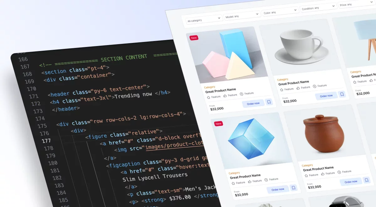
Template files structure
📂 Ecommerce-html
    │
    ├── 📂 images/
    ├── 📂 html-components/
    │   ├── 📄 headers.html
    │   ├── 📄 cards.html
    │   ├── 📄 dialogs.html
    │   └── 📄 ...others
    │
    ├── 📂 scss/
    │   ├── 📂 components/
    │   ├── 📂 utilities/
    │   ├── 📂 layout/
    │   │
    │   ├── 📄 _breakpoint-config.scss
    │   ├── 📄 _grid-system.scss
    │   ├── 📄 _reset.scss
    │   ├── 📄 _theme.scss
    │   ├── 📄 _variables-root.scss
    │   └── 📄 final.scss
    │
    ├── 📂 css/
    │   ├── final.css
    │   └── final.min.css
    └
    📄  page-home-1.html
    📄  page-home-2.html
    📄  page-home-3.html
    📄  page-home-4.html
    📄  page-home-5.html
    📄 ...other pages
Along with coded files, you will receive a Figma file (and link to duplicate).
Grid System
Grid system of ecommerce-ui uses rows and columns. It’s built with flexbox and is fully responsive.
We're inspired by Bootstrap's approach. https://getbootstrap.com/docs/5.3/layout/grid/
The only differences are:
We use Tailwind like naming for different breakpoints.
For ex: instead of writing col-lg-6, We use lg:col-6
Basic grid:
<div class="container">
  <div class="row">
    <div class="col"> Column </div>
    <div class="col">  Column </div>
    <div class="col">  Column  </div>
  </div>
</div>
Advanced grid (responsive)
The example below explains that all devices have a width of 12 columns by default. Tablets have a width of 6 columns (md:col-6), while desktop screens have a width of 3 columns (lg:col-3).
  <div class="row">
    <div class="lg:col-3 md:col-6 col-12"> Column </div>
    <div class="lg:col-3 md:col-6 col-12">  Column </div>
    <div class="lg:col-3 md:col-6 col-12">  Column </div>
    <div class="lg:col-3 md:col-6 col-12">  Column  </div>
  </div>
Use {breakpoint}:col-auto classes to size columns based on the natural width of their content.
Row columns
Another way to display a grid is by simply adding a class name to the parent (row) element.
Use {breakpoint}:row-cols-{x} to generate any number of columns from 1 to 12. This method is useful for creating a grid for product cards with 5 columns or 7 columns and multiple rows.
<div class="container">
  <div class="row lg:row-cols-5 sm:row-cols-3 row-cols-1">
    <div class="col"> Column </div>
    <div class="col"> Column </div>
    <div class="col"> Column </div>
    <div class="col"> Column </div>
    <div class="col"> Column </div>
    <div class="col"> Column </div>
  </div>
</div>
For more customization, check the folder /scss/_grid-system.scss
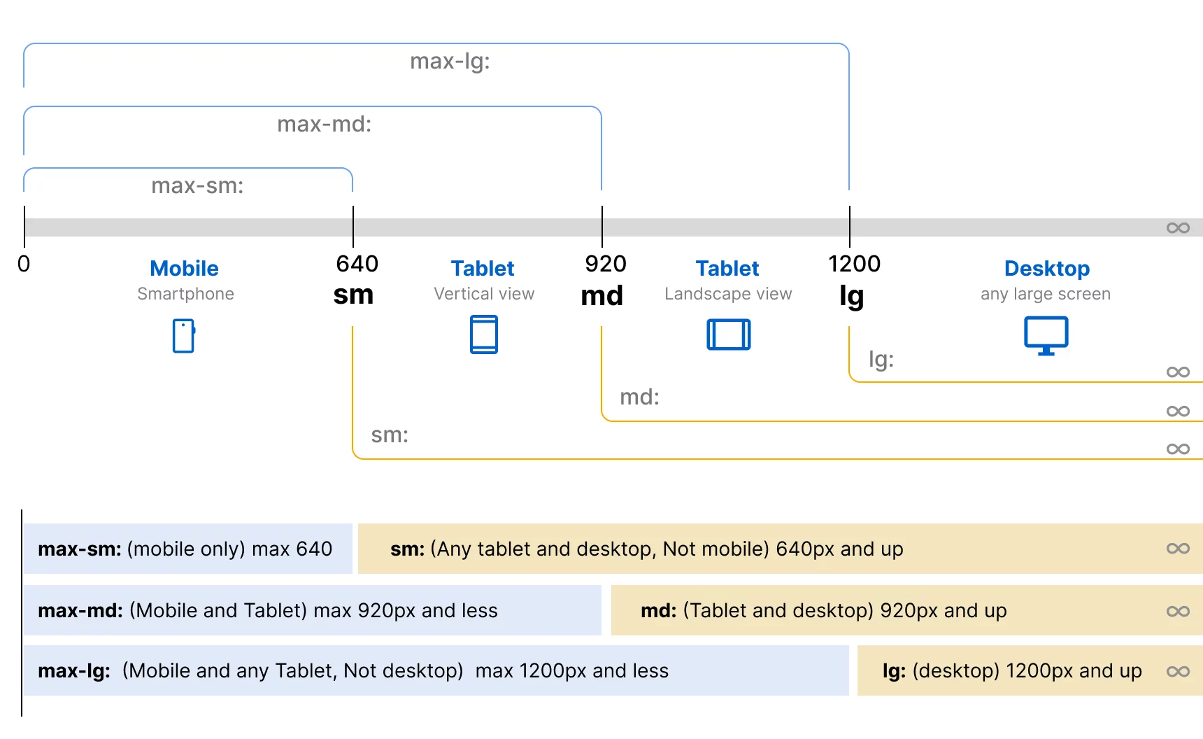
Breakpoints
We use a simple breakpoint approach for mobile-first design and desktop-first design.
sm = 640px
md = 920px
lg = 1200px
Breakpoints are generated via sass (scss) which you can customize upon your needs
/scss/_breakpoint-config.scss
$breakpoints: (
  // *** Device only breakpoints *** //
  'max-lg': 'max-width: 1200px', // Tablet and smaller
  'max-md': 'max-width: 920px',  // Mobile only
  'max-sm': 'max-width: 640px',  // Mobile only

  // *** Classic breakpoints *** //
  'sm': 'min-width: 641px',  // not mobile, - small tablet and up
  'md': 'min-width: 921px', // medium and up - larger tablet and up
  'lg': 'min-width: 1201px', // large and up - desktop and any widescreen
);
There are two options for implementing them: Either mobile-first or desktop-first approach. Because today, most web projects like SaaS or e-commerce sites are made separately for desktop and have a separate front-end for mobile. That's why sometimes it's better to create desktop-first and then override for small screens. To ensure a seamless user experience, it's crucial to consider both desktop and mobile users in the design and development process.
For example, if you want to hide an element just for mobile, there are two approaches.
Option 1 (mobile-first approach):
<div class="d-none sm:d-block">
  This element is hidden on smartphone
</div>
Option 2 (desktop-first approach):
<div class="max-sm:d-none">
   This element is hidden on smartphone
</div>
Same works for other utility classes. Let's add padding around text only for desktop
<p class="lg:p-2"> This text has 8px padding around for desktop only</p>Another way of doing that
<p class="p-2 max-lg:p-0"> This text has 8px padding around for desktop only</p>This method is helpful usually if you want to hide certain items just for mobile. For example, the header part of a website or the mega menu part. So you just add max-sm:d-none classnane
Here is the illustration for better understanding:
Margin & Padding
Ecommerce-ui includes a wide range of shorthand responsive margin and padding utility classes to modify an element’s appearance.
The classes are named using the format {breakpoint}:{property}{sides}-{size}
For example: `lg:mt-10`
margin-top:40px for only large screens
Here is information about short names.
m-{number} for classes that set `margin`
p- {number} - for classes that set `padding`
ml-{number} - stands for `margin-left`
mr-{number} - stands for `margin-right`
mt-{number} - stands for `margin-top`
mb-{number} - stands for `margin-bottom`
mx-{number} - stands for `margin-left` and `margin-right`
my-{number} - stands for `margin-top` and `margin-bottom`
pl-{number} - stands for `padding-left`
pr-{number} - stands for `padding-right`
pt-{number} - stands for `padding-top`
pb-{number} - stands for `padding-bottom`
px-{number} - stands for `padding-left` and `padding-right`
py-{number} - stands for `padding-top` and `padding-bottom`
What numbers are allowed?
{number} | Value |
|---|---|
0 | 0 |
1 | 4px |
2 | 8px |
3 | 12px |
4 | 16px |
5 | 20px |
6 | 24px |
7 | 28px |
8 | 32px |
9 | 36px |
10 | 40px |
11 | 44px |
12 | 48px |
14 | 56px |
16 | 64px |
18 | 72px |
20 | 80px |
25 | 100px |
30 | 120px |
35 | 140px |
40 | 160px |
45 | 180px |
50 | 200px |
55 | 220px |
60 | 240px |
65 | 260px |
70 | 280px |
75 | 300px |
80 | 320px |
85 | 340px |
90 | 360px |
95 | 380px |
100 | 400px |
unset | unset |
initial | initial |
auto | auto |
Examples:
<div class="m-10 p-5"> Element with padding and margin </div>
<div class="mx-auto p-20 max-sm:p-0"> Element has margin auto from left & right and responsive padding </div>
<div class="lg:mt-20"> Element has margin-top:80px for large screen only </div>Buttons
Our button classes is similar to Bootstrap CSS, use btn classname for basic styling.
And add modifier classes like btn-primary or btn-neutral and but with additional features.
But avoid using class names like btn-danger or btn-success, Instead use btn-red or btn-green
Button styles is based on color theme (scss/_theme.scss)

Here are a list of most used button styles
<a href="#" class="btn btn-default"> Button </a>
<a href="#" class="btn btn-neutral"> Button </a>
<a href="#" class="btn btn-primary"> Button </a>
<a href="#" class="btn btn-red"> Button </a>
<a href="#" class="btn btn-green"> Button </a>
<a href="#" class="btn btn-orange"> Button </a>
<a href="#" class="btn btn-yellow"> Button </a>
<a href="#" class="btn btn-purple"> Button </a>
<a href="#" class="btn btn-teal"> Button </a>
<a href="#" class="btn btn-dark"> Button </a>

<a href="#" class="btn btn-outline"> Button </a>
Buttons also have subtle variants of colors:

<a href="#" class="btn btn-primary-subtle"> Button </a>
<a href="#" class="btn btn-red-subtle"> Button </a>
<a href="#" class="btn btn-green-subtle"> Button </a>
<a href="#" class="btn btn-orange-subtle"> Button </a>
<a href="#" class="btn btn-yellow-subtle"> Button </a>
<a href="#" class="btn btn-purple-subtle"> Button </a>
<a href="#" class="btn btn-teal-subtle"> Button </a>
Size of buttons:
Buttons support 4 sizes, Add class name btn-sm (Small), btn-lg (Large), btn-xl (Very large), By default it is in medium size (40px height)
<a href="#" class="btn btn-default btn-lg"> Large Button </a>
<a href="#" class="btn btn-default btn-sm"> Small Button </a>
Icon button
if button contains only icon add class name "btn-icon"
<a href="#" class="btn btn-default btn-icon"> 👍 </a>
<a href="#" class="btn btn-default btn-sm btn-icon"> 👍 </a>
Rounded button
Add any utility class to customize button, For ex: rounded-full
<a href="#" class="btn btn-primary rounded-full"> Button </a>Customizing hover
You can customize button using CSS variangles. Here is example: (On hover it will become red)
<a href="#" class="btn btn-primary" style="--btn-bg-hover:red"> Button </a>Want more customization?
Check folder: scss/components/_button.scss
You can change any style and compile scss/final.scss file
Use any SASS compiler like Prepros.io or Codekit
Download E-commerce
Templates & Design System
This UI library is awesome for making
your e-commerce
project look seriously Pro
.
Beautiful UI and simplicity are what draw customers in, right?
Every hour of your time costs money!
It'll save you a ton of time
and make your work shine
FULL VERSION (-40% off)
$16
For Professionals & Design Teams
FREE VERSION
$0
For Beginners and Students